Exhibition banners are your brand’s shining star, drawing the attention of passersby and imparting vital information in a glance. But when those vibrant displays are met with harsh, glaring lights, they can become less of a beacon and more of a blinding obstacle. Fear not! We’re here to illuminate your path to creating stunning, glare-free banners that will dazzle your audience without overwhelming their senses. Let’s dive into some bright ideas to help your banners shine in the best light possible!
Bright Ideas to Diminish Glare on Your Banners!
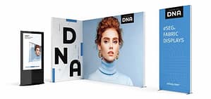
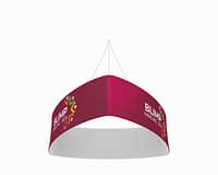
First and foremost, the choice of material can make all the difference in reducing glare. Opt for matte finishes instead of glossy ones, as matte materials are excellent at diffusing light, preventing those pesky reflections. Consider vinyl or fabric banners with a matte coating to absorb light instead of bouncing it back into the eyes of your viewers. This subtle change can dramatically transform how your message is received under the bright exhibition lights.
Lighting placement is another critical factor to consider when setting up your exhibition. Instead of allowing overhead lights to beam directly down onto your banners, use diffuse or indirect lighting techniques. Place your lights at an angle or use softer lighting to create an even distribution that highlights your banner without causing intense glare. This not only improves visibility but also contributes to an inviting atmosphere that encourages visitors to engage with your display.
Lastly, don’t underestimate the power of strategic positioning! Take a moment to observe the layout of your exhibition space before setting up your banners. If possible, position your banners away from direct light sources or areas where bright lights converge. If certain spots seem unavoidable, consider using physical barriers or secondary displays to shield your banners from intense glare. Such mindful placement can ensure that your banners are both eye-catching and easy to read, even in challenging lighting conditions.
Shine Bright: Tips for Eye-Catching, Glare-Free Displays!
Once you’ve tackled glare with the right materials and lighting, it’s time to focus on the design of your banners themselves. Bold colors and high-contrast text can help your message stand out, even in less-than-ideal lighting. Choose colors that won’t wash out under bright lights; darker hues often work better in high-glare environments. Pair these colors with clear, legible fonts to ensure your content is easy to read from a distance. Remember, simplicity is key—too much clutter can make your banner feel busy and overwhelming.
Consider incorporating visual elements that draw the eye while minimizing glare. For instance, use large images or graphics that don’t rely on shiny accents or metallic finishes. Instead, opt for flat designs that engage the viewer without reflecting light back into their eyes. A well-placed logo or a captivating image can serve as a focal point, guiding visitors to your key messages without any distraction from glare.
Finally, test your banners in the lighting conditions they will be displayed in prior to the event. Take the time to set up your display in a mock exhibition space to see how the banners react to the lights. This allows you to make adjustments before the big day, ensuring that your banners not only convey your brand’s message but do so in a visually appealing manner. Remember, a little preparation goes a long way in creating an engaging, glare-free experience for your audience!
With the right techniques in place, your exhibition banners can stand out brilliantly without the irritation of glare. By selecting suitable materials, positioning your displays thoughtfully, and designing with clarity in mind, you’ll create an exhibition experience that’s both eye-catching and welcoming. So the next time you prepare for an event, keep these bright ideas in your toolkit, and watch your banners shine like never before. Here’s to a glare-free and vibrant exhibition adventure!