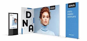
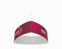
Exhibition banners are more than just colorful displays; they are powerful marketing tools that create first impressions, communicate messages, and draw in potential customers. A well-designed banner can make a significant difference in a crowded exhibition hall, but there are common pitfalls that many designers fall into when crafting their displays. Knowing what to avoid can be just as important as knowing what to include. Let’s explore some bright ideas for design and the blunders worth avoiding.
Bright Ideas: Design Your Exhibition Banner Right!
When designing your exhibition banner, start with a clear and concise message. Think about what you want your audience to take away from your display. A catchy tagline or slogan can effectively convey your brand’s identity in just a few words. Aim for simplicity; your audience should grasp your message in seconds as they pass by. Remember, less is often more when it comes to text on banners!
Next, focus on using high-quality visuals. Bold images and graphics can significantly enhance your display, attracting attention and creating a memorable impression. Make sure your visuals are relevant to your message and resonate with your target audience. Consider employing a color scheme that aligns with your brand’s identity, as consistency in colors can reinforce brand recognition and create a cohesive look.
Lastly, don’t underestimate the power of typography. Choose fonts that are easy to read from a distance. The size, style, and color of your text can either enhance or detract from your message. Pair a bold headline with a simpler body font to ensure clarity. Testing different font combinations can be a fun creative exercise, so let your imagination run wild while keeping readability in mind!
Avoid These Banner Blunders for a Stunning Display!
One of the most common mistakes in designing exhibition banners is overcrowding. Stuffing too much information onto a single banner can overwhelm viewers, causing them to walk away confused rather than intrigued. Stick to the key points and prioritize essential information to maintain clarity. Remember, the goal is to spark interest, not to provide a detailed lecture.
Another blunder is neglecting the importance of layout and spacing. A cluttered design can make your banner look unprofessional. Ensure there is enough white space around your elements to allow them to breathe. This not only makes your banner visually appealing but also guides the viewer’s eye to the most important information. A well-structured layout helps create a logical flow, making it easier for passersby to absorb your message.
Finally, don’t forget to consider the viewing distance. Banners are usually viewed from several feet away, so large fonts and bold colors are essential. Avoid intricate details or small text that may be lost when viewed from afar. Instead, think about how your banner will look at a distance and design accordingly. This foresight can be the difference between a display that captures attention and one that gets overlooked!
Designing an exhibition banner is an exciting opportunity to showcase your brand and connect with your audience. By focusing on clear messaging, high-quality visuals, and thoughtful typography, you can create a banner that stands out in any exhibition environment. Remember to avoid common mistakes like overcrowding, poor layout, and small text to ensure your display is effective. With these bright ideas and tips in mind, you’re well on your way to crafting a stunning exhibition banner that captures attention and leaves a lasting impression! Happy designing!


